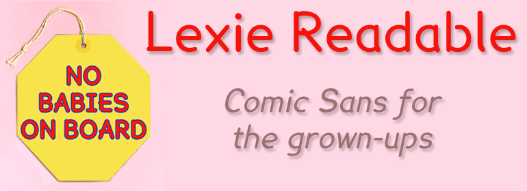
Vincent Connare’s Comic Sans arouses great passions. In schools here in England it is held up as the font that children find easiest to read, it is a ubiquitous success story, and its inappropriate use has tormented many a typographer. We confronted our fear and looked into the mouth of the lion. Lexie Readable (formerly Lexia Readable) is a family of fonts designed for maximum legibility, it’s an attempt to capture the clarity and accessibility of Comic Sans without the American comic book associations and whimsical childlike quality which are culturally inappropriate for many uses and may seem patronizing.
Lexie is an attempt to retain the strength, friendliness and legibility of Comic Sans, and even a slightly marker-drawn feel, whilst tidying up the comic book idiosyncrasies. It adds a hint of dignity, a sprinkling of refinement, and introduces elements of designer type to appeal to a contemporary audience.
While Comic Sans has long been a preferred choice for infant typography from ‘Baby on Board’ stickers onward, its use risks undermining any serious message and appearing condescending to readers with greater visual maturity, issues that are particularly acute when applied to adolescent and adult literacy.
Typographical concerns from recent educational publications and discussions, and some highlighted by the British Dyslexia Association have been incorporated into the design of Lexie Readable – the simpler, handwritten forms of a and g, the non-symmetry of letters such as b and d, good sized descenders and ascenders, generous spacing and excellent screen clarity.
Dyslexia.com offer the font from their website, Abigail Marshall commenting, “I am not utterly convinced that Lexie is superior to ComicSans (my personal favorite), which is also available to our users — but I do have to note that as soon as I converted our site to the Lexie Readable view, I immediately spotted a typographical error on the page that had previously eluded me. Lexie has been accepted for inclusion in the site customization feature of the Dyslexia.com web site.”
When information about the typeface was posted on the Typophile Forums, Vincent Connare, suggested a better name might be ‘Our Kid’, maybe ‘Comic Sons’, I suggested. Vincent mentioned that Dalton Maag already had a typeface called Lexia and I’ve recently been persuaded to do the honourable thing and change Readable’s name to Lexie.

