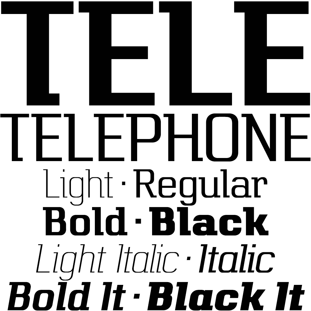
Telephone is a geometric semi-slab family with block serifs positioned to assist wordflow.
The typeface evolved from an italic wordmark designed in 1966 for the British GPO by the Banks & Miles agency to publicize all-figure telephone dialling (all-number calling), and the new fonts retain that italic spirit, even in the upright romans. The squarish glyphs, with a mix of rounded and angular corners, have a post-modern feel suggesting technological advance, innovation and vitality.
A wide version of this typeface is also available – Telephone Extended
