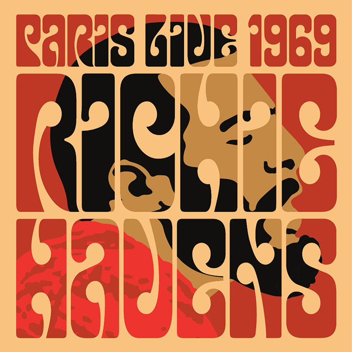
2005 was a Summer of Love in the sunny North West of England, give or take a few rainy fortnights. After having bought a copy of Gastaut and Criqui’s book ‘Off the Wall – Psychedelic Rock Posters from San Francisco’, we went to the Liverpool Tate Gallery and saw their Summer of Love exhibition. The best part was right at the start, a big room filled with those magical hippie posters by Rick Griffin, Wes Wilson, my favourite Victor Moscoso, and others, not forgetting the marvellous Martin Sharp, the Australian artist who lived here in England in the sixties.
Apart from being stunned by the amazing colours of the original posters, I’d already begun to look closely at Victor Moscoso’s letterforms and start work on a font inspired by the hugely exaggerated slab serifs on posters like his ‘Horns of Plenty’ featuring Quicksilver Messenger Service and Big Brother & the Holding Company. And so K-Type Bigfoot was born, Moscoso-inspired but with a completely new set of lower case letters that were pretty tricky to keep in character.
Then came a beautifully blobby Victor Moscoso font based on the artist’s Moby Grape ‘Neptune’s Notion’ alphabet that has its origins in nineteenth century wood type, the Magical Mystery Tour fonts, and fonts inspired by the lettering of Rick Griffin which feature a new lowercase characters that sit just right. Also, a Wes Wilson font based on the letterforms of the Austrian Secessionist, Alfred Roller.

